





Maitland Metro
Maitland Metro is a new mixed-use precinct just outside the Cape Town CBD. It includes more than one of the existing blocks of buildings. The intention is to upgrade the component buildings and introduce new low-cost rental residential apartments, as well as commercial and light industrial opportunities close to the City, over the next 5 to 10 years. The first development, The Prime, affordable residential apartments, was recently completed.
The Task:
To launch the Maitland Metro precinct as a major new development close to the City. In addition, to solicit interest in and applications for the first component, The Prime, a low-cost, residential rental apartment building.
The Work:
As a new property development, Maitland Metro required a brand identity. This also included a naming and logo design system for the individual buildings making up the component parts of the precinct. The Prime is the first of these.
www.maitlandmetro.co.za
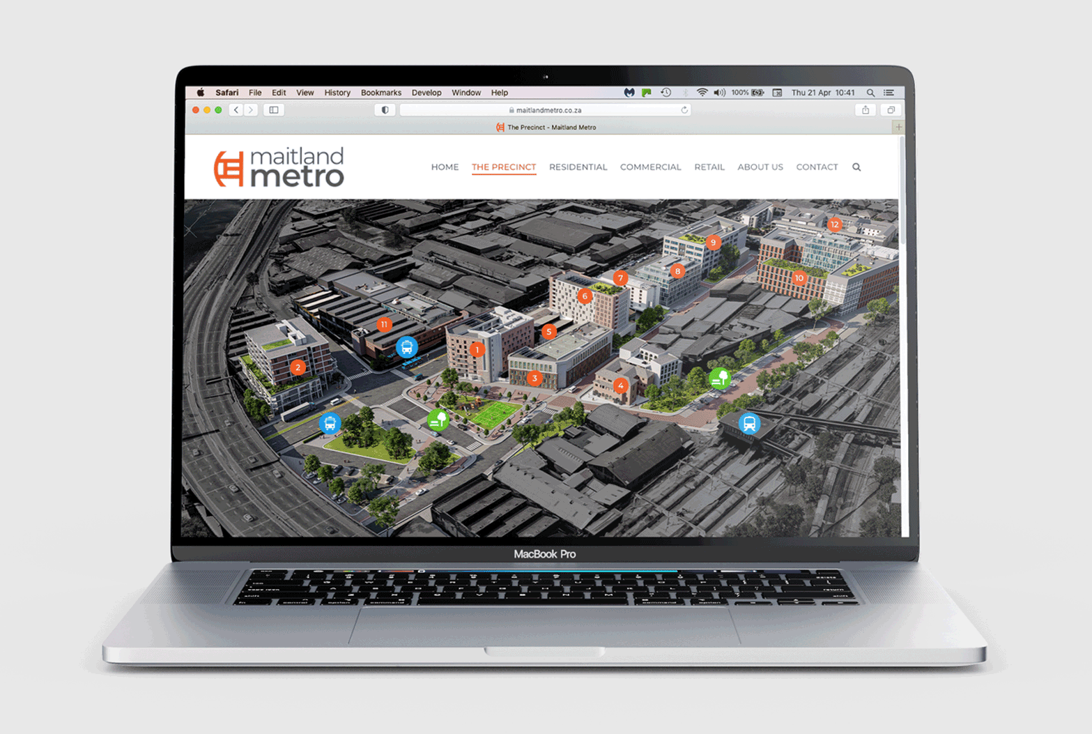
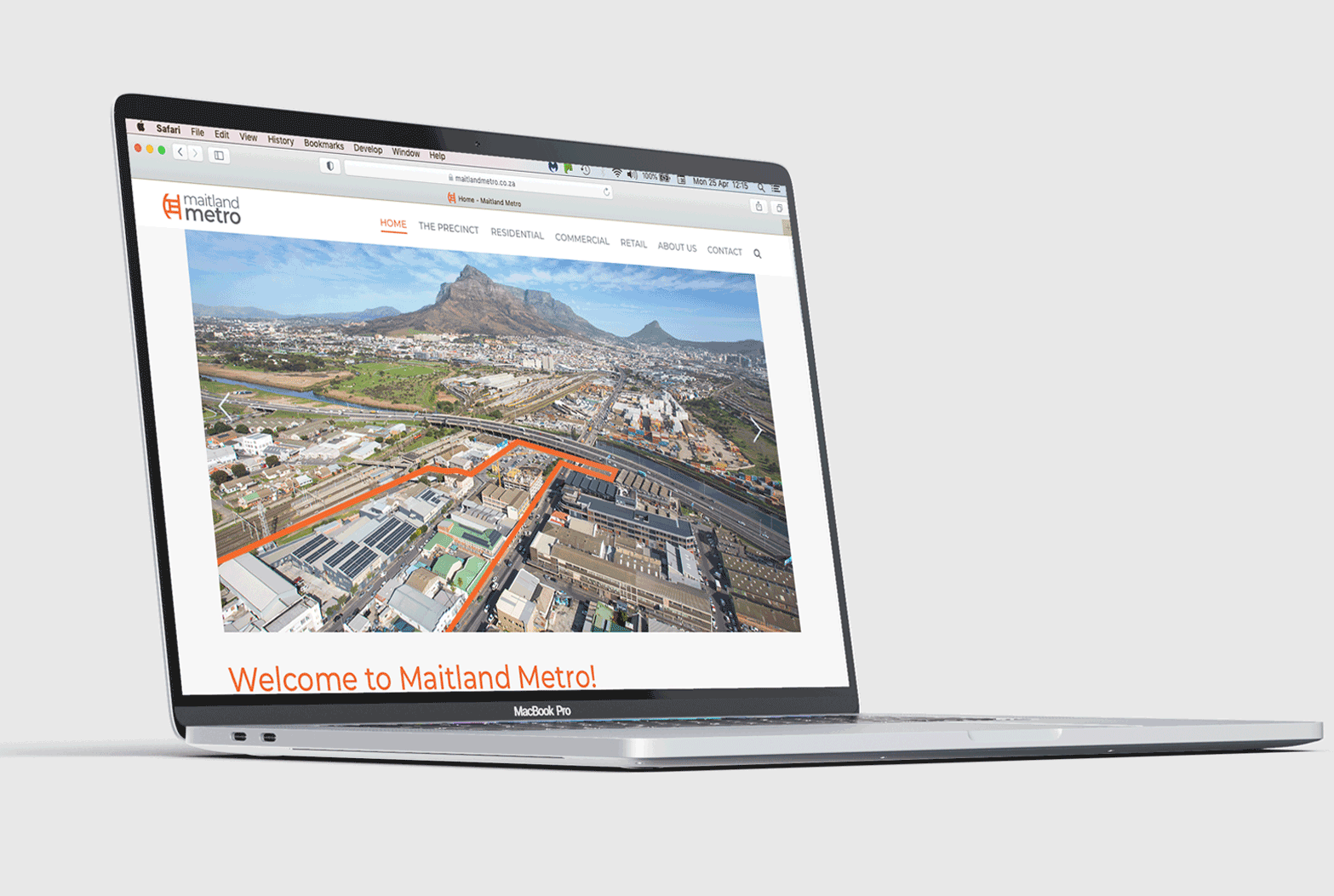
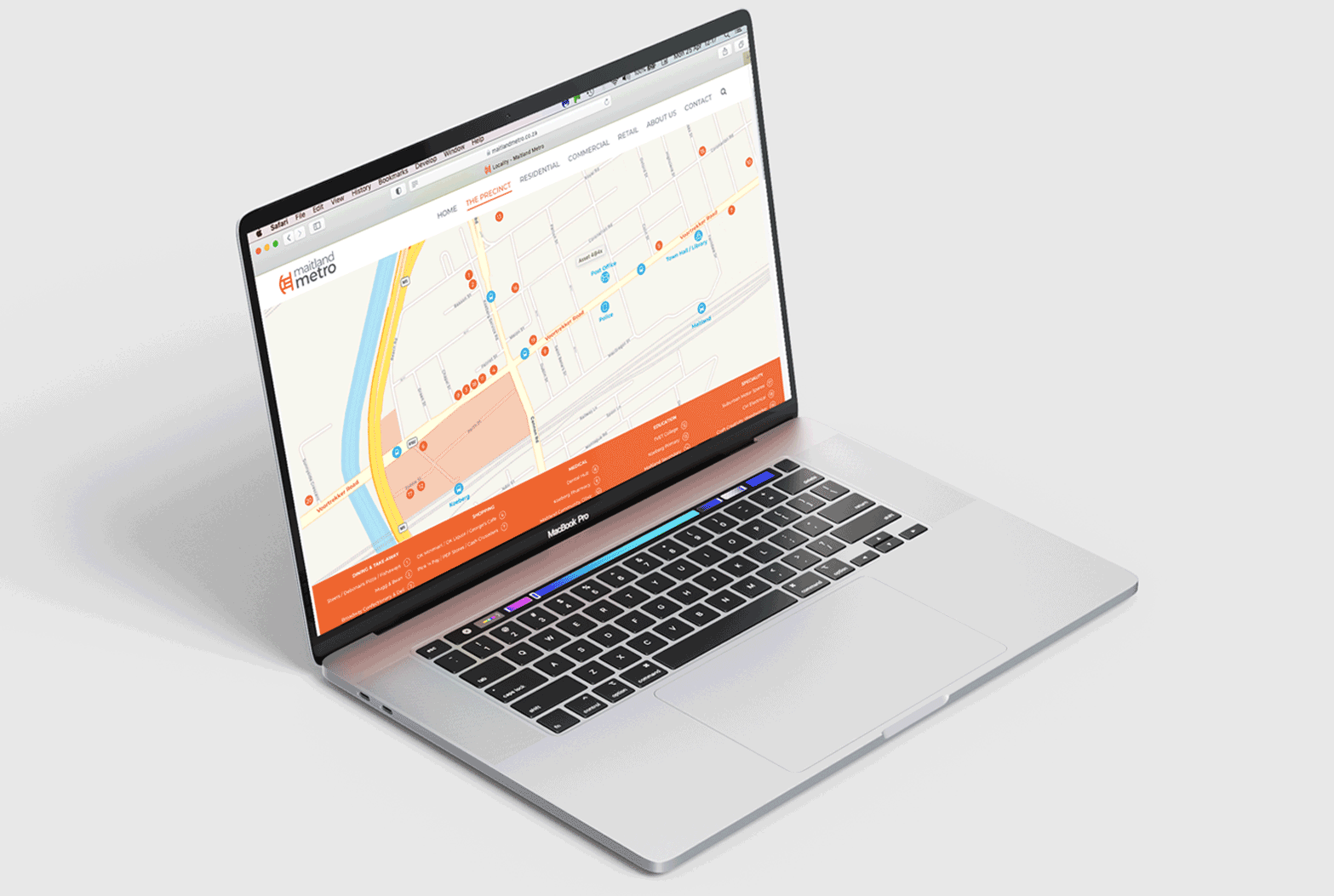
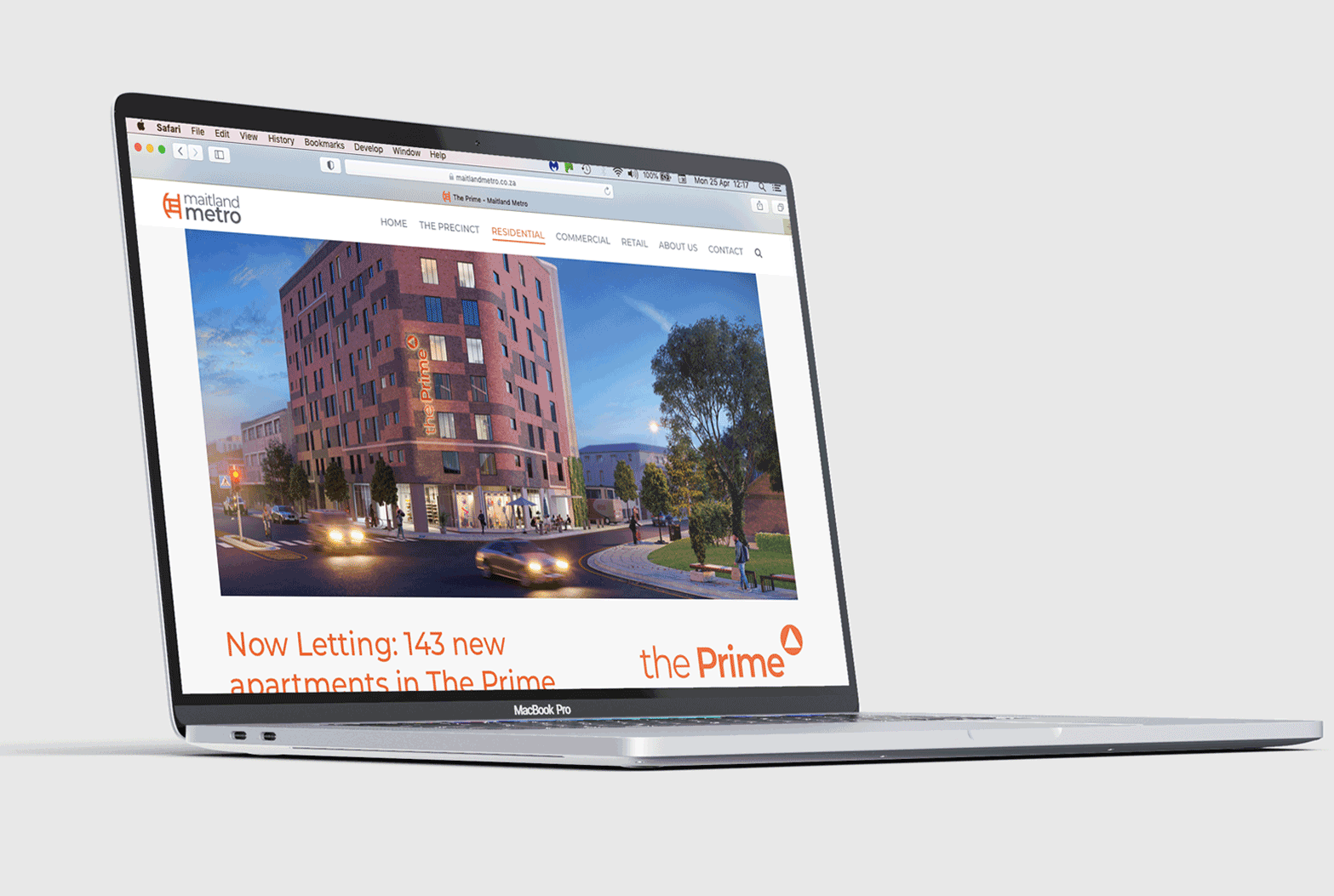
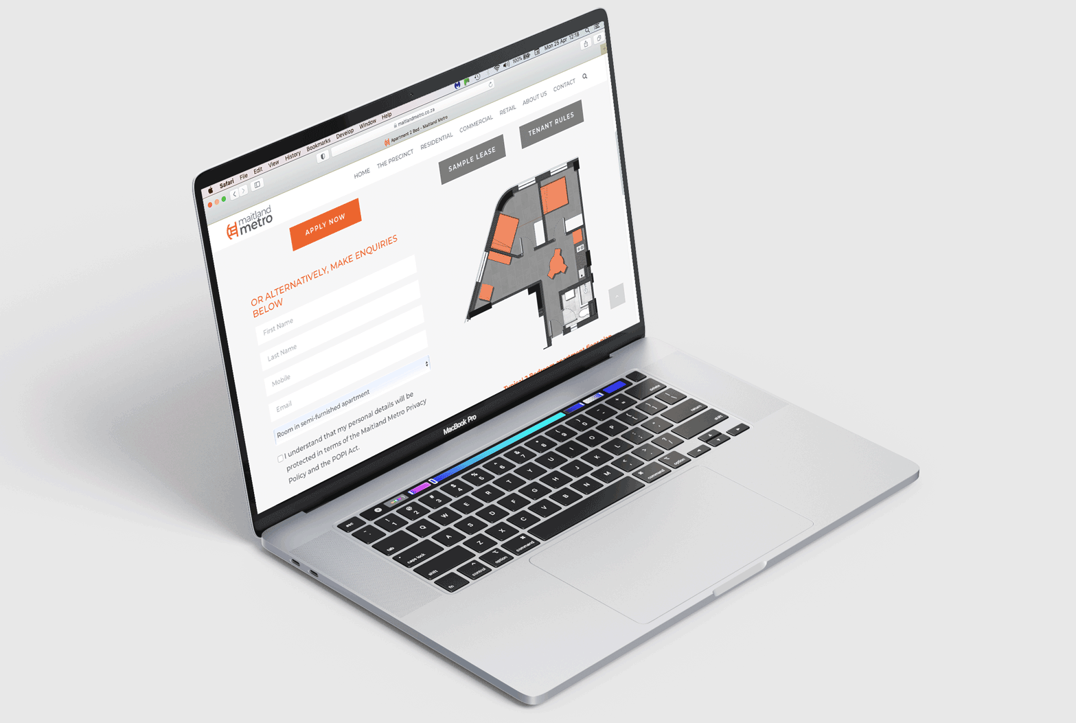
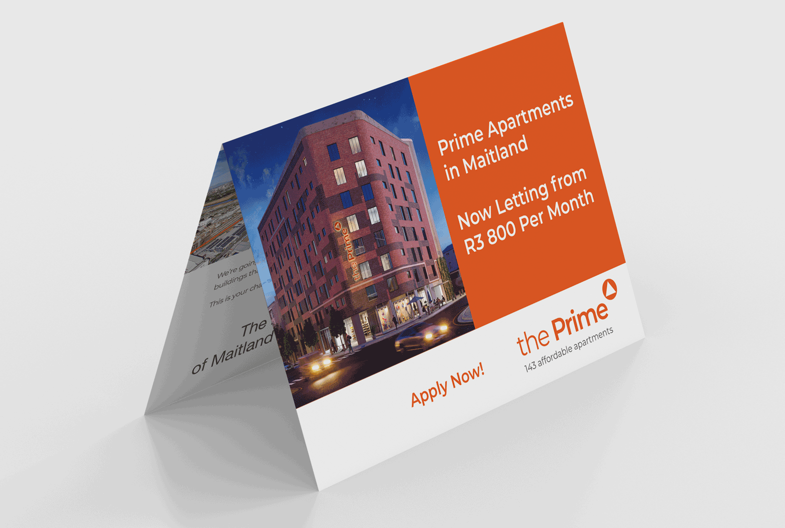
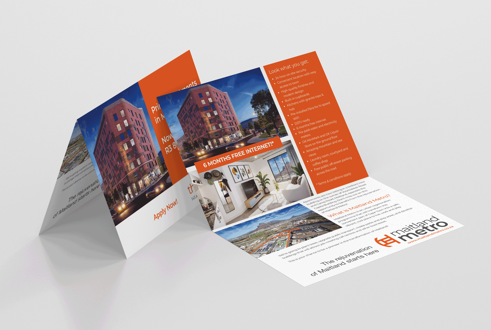
The major components of the launch were a comprehensive website including a fully online application process for The Prime. To solicit interest and spread the word, large on site hoardings with QR codes were used as well as leaflets delivered to local businesses and homes.
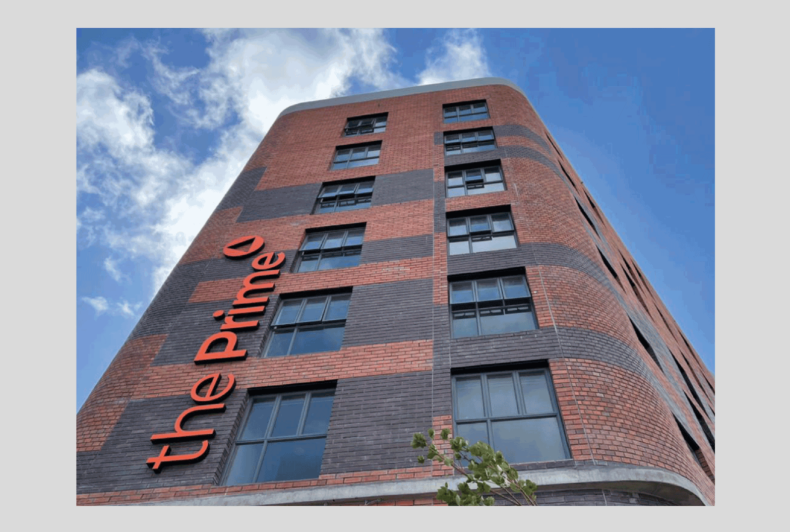
In addition, the building signage and the tenant sign system was designed and managed.
1. The brand identity manual
2. The brand mark development
3. The brand signature in black (mono)
4. The brand signature in colour
5 - 8. The Maitland Metro website
9. The Prime logotype.
10. The Prime main exterior building sign
11-13. The Prime website
14-15. The Prime leaflet