1


2
3
4
5
6
7
8
9
10
11
12
13
14
15
16
Maitland Metro
Maitland Metro is a new precinct being developed which will contain new low-cost housing rental apartments, retail spaces and commercial properties, thus rejuvenating the area just north of Cape Town CBD.
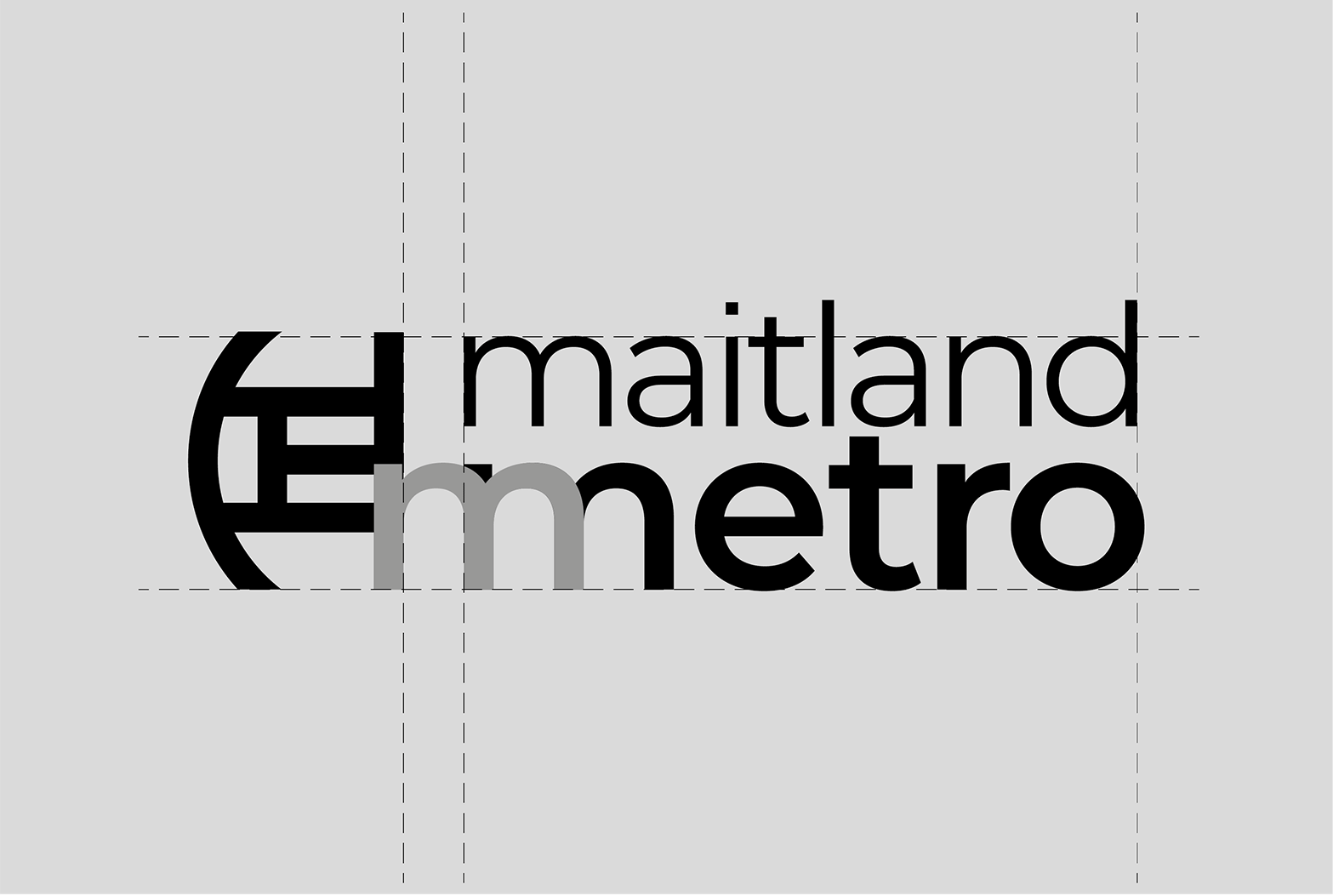
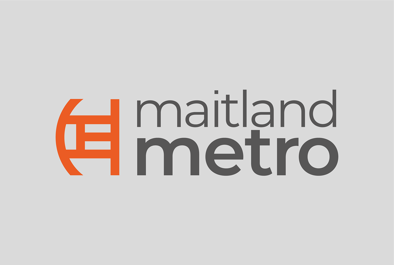
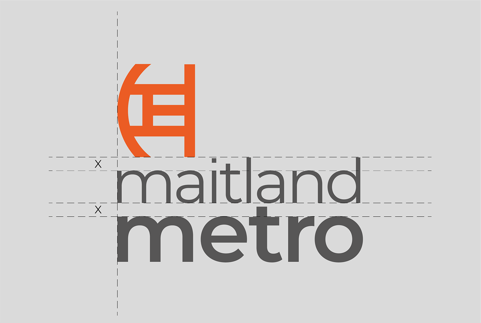
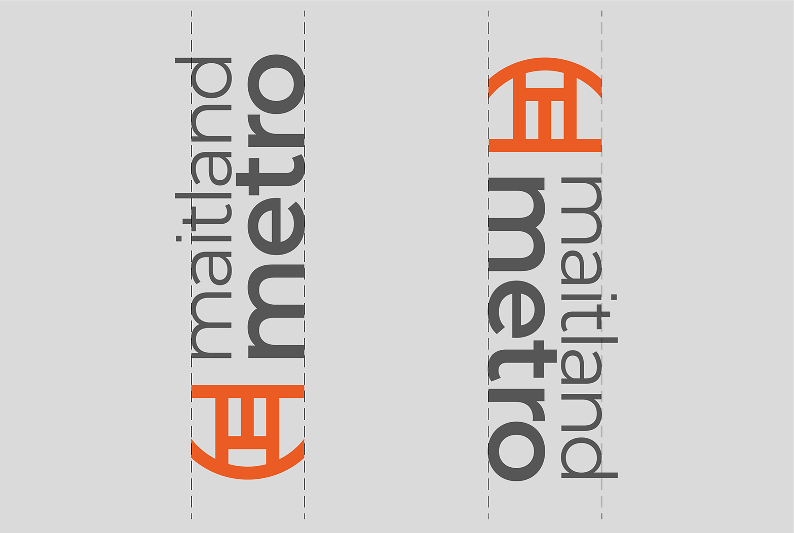
We were tasked with designing a new brand identity. Shown here is a selection of items from the brand manual.
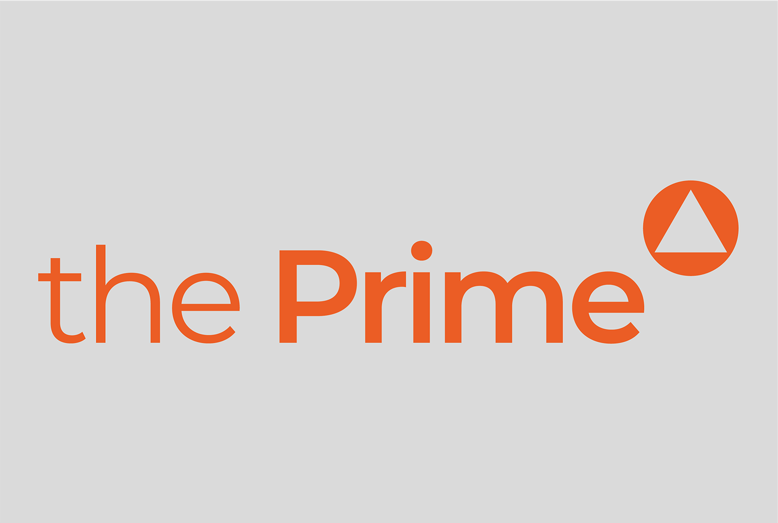
The commission also included developing a palette of logotypes for the 10 envisioned new and rejuvenated buildings in the precinct. The first of these logotypes, for The Prime low-cost rental apartments, is included here.
See other work for the launch campaign on our website, here.
Shown here:
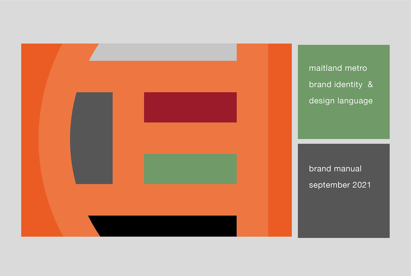
1 The brand manual cover
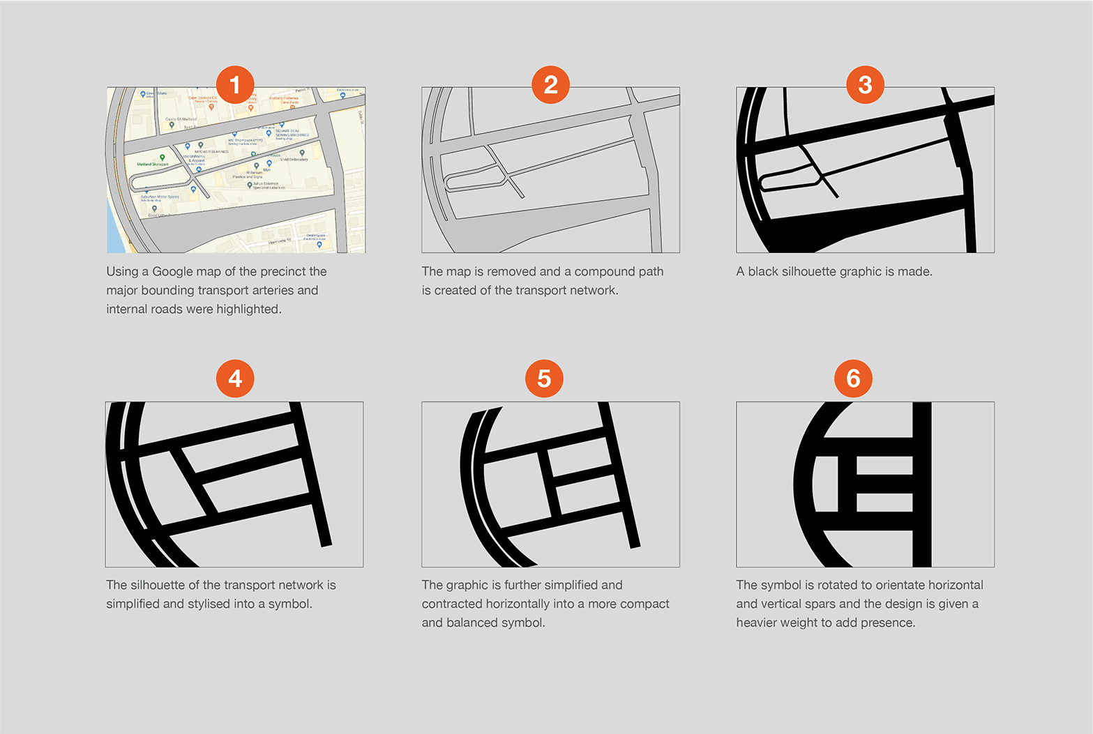
2 The brand mark development based on the streets of the precinct.
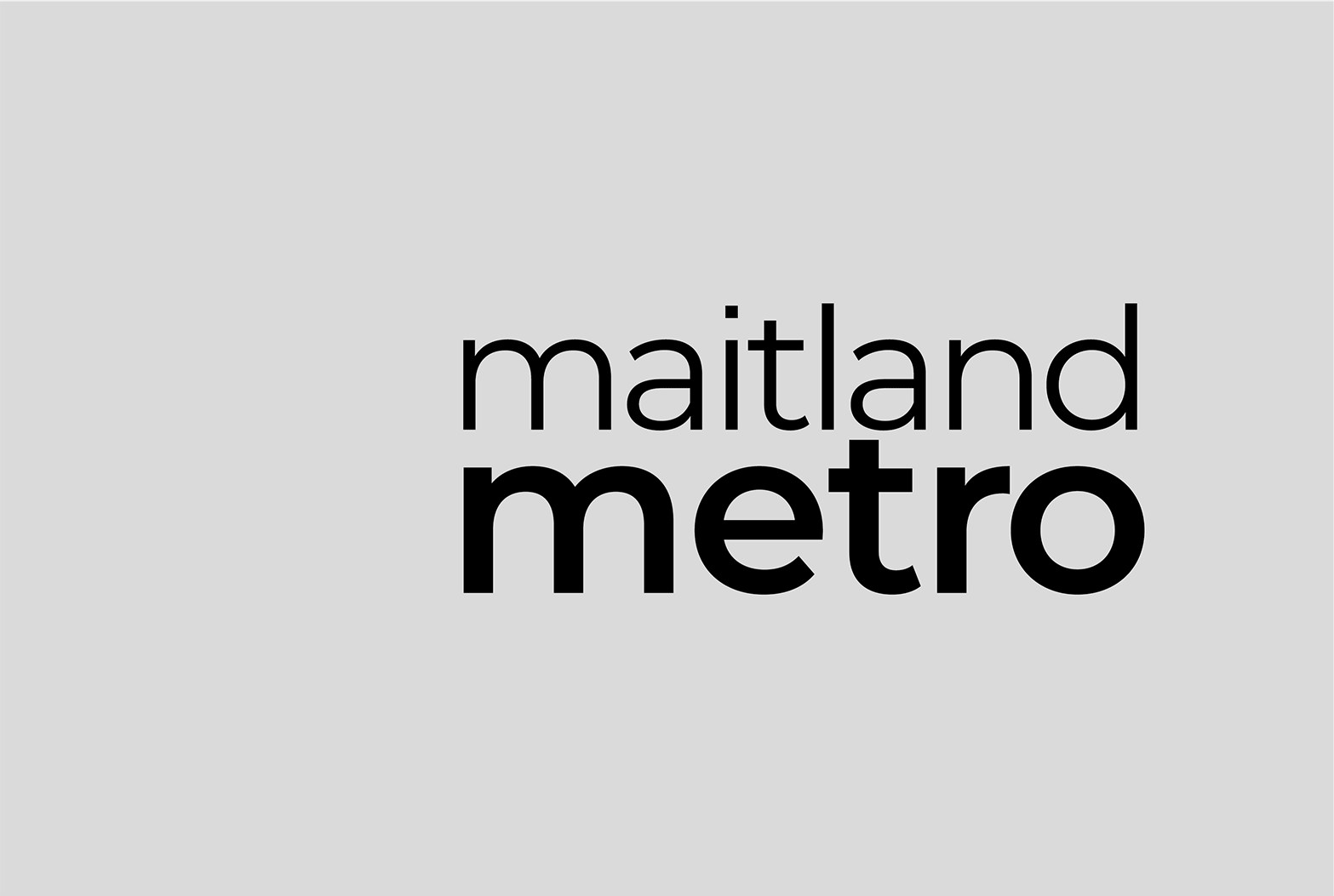
3 The logotype in black.
4 The brand mark and logotype in black.
5 The brand signature in colour.
6 The stacked brand signature.
7 The vertical brand signatures.
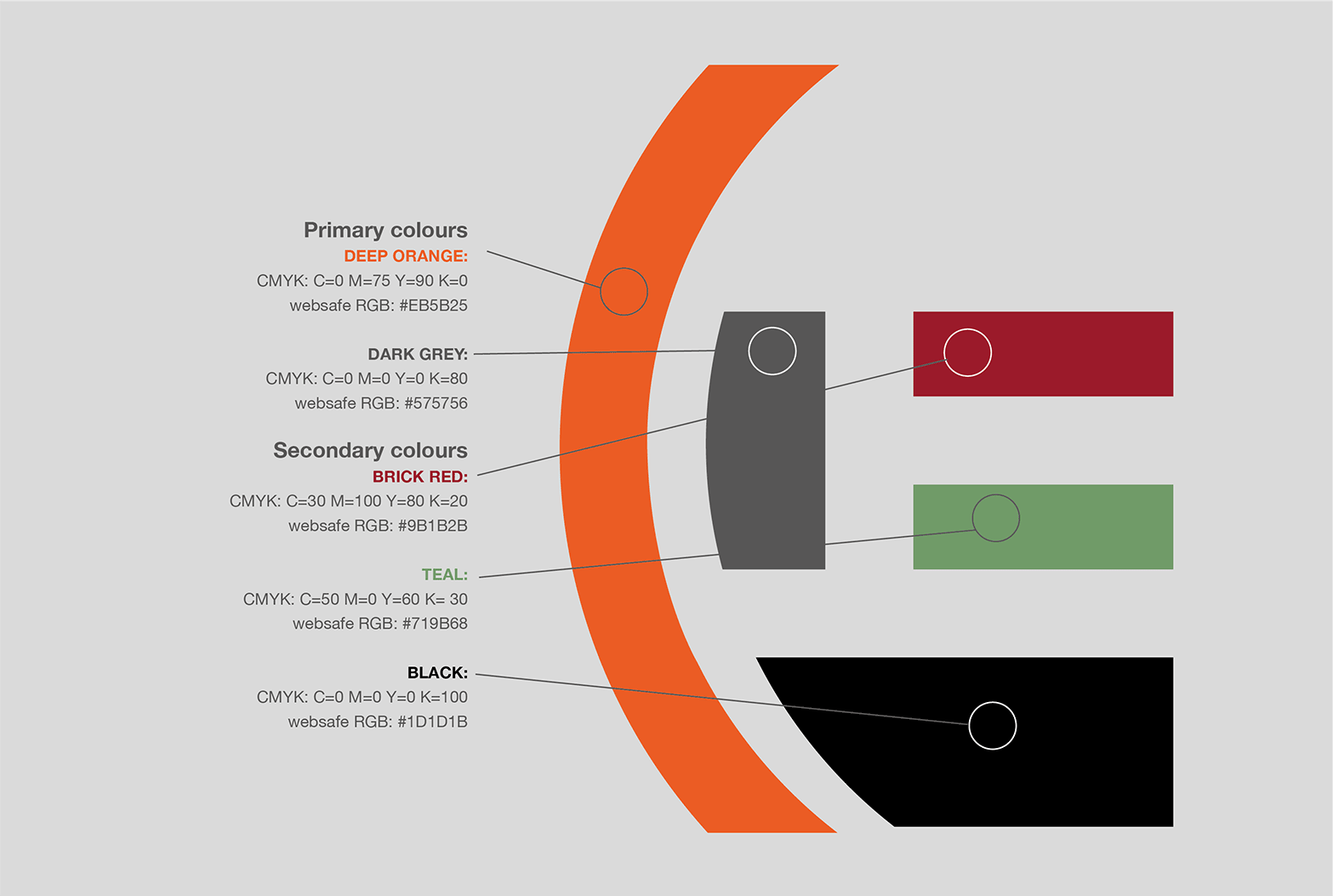
8 The brand colour palette.
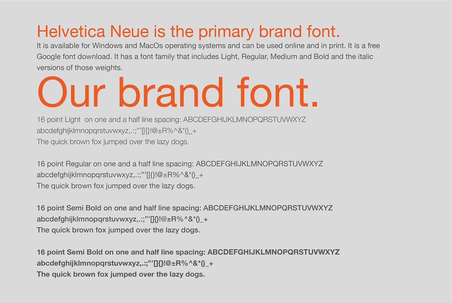
9 The primary brand font.
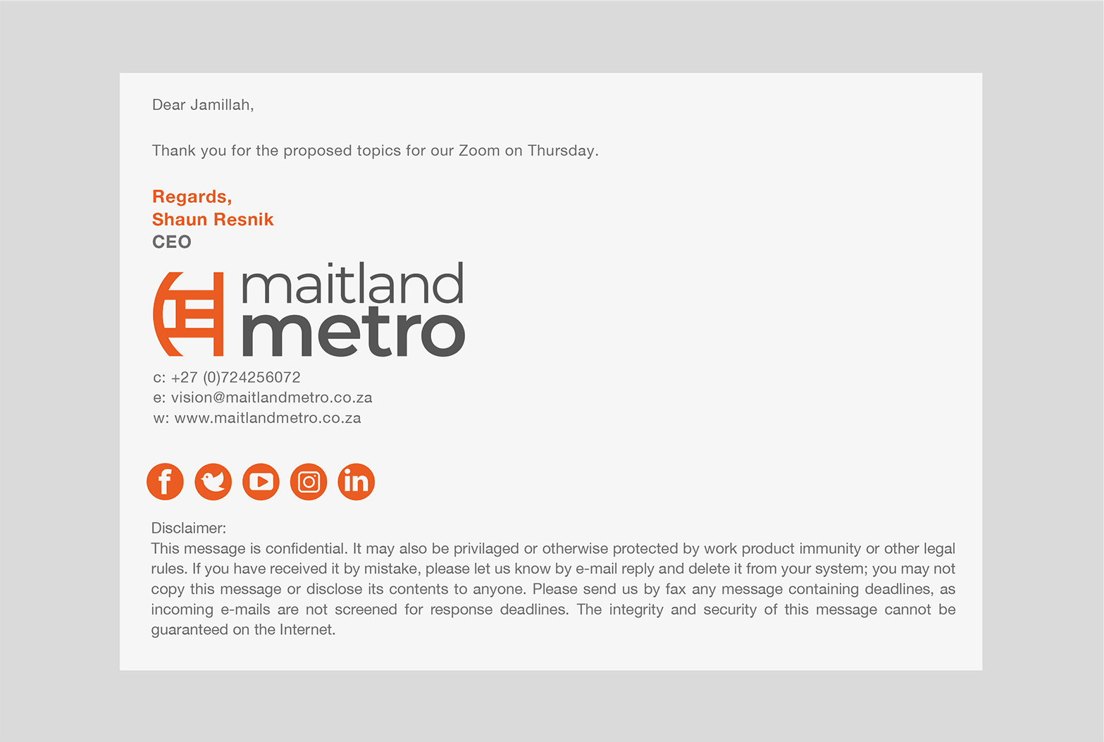
10 Brand expression – email signature.
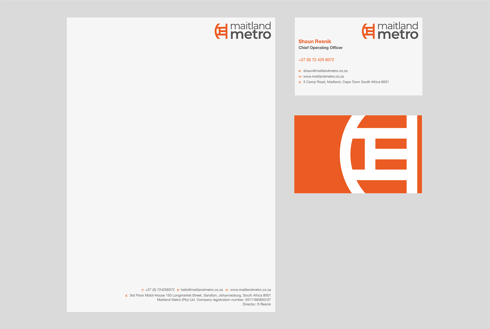
11 Brand expression – print stationery.
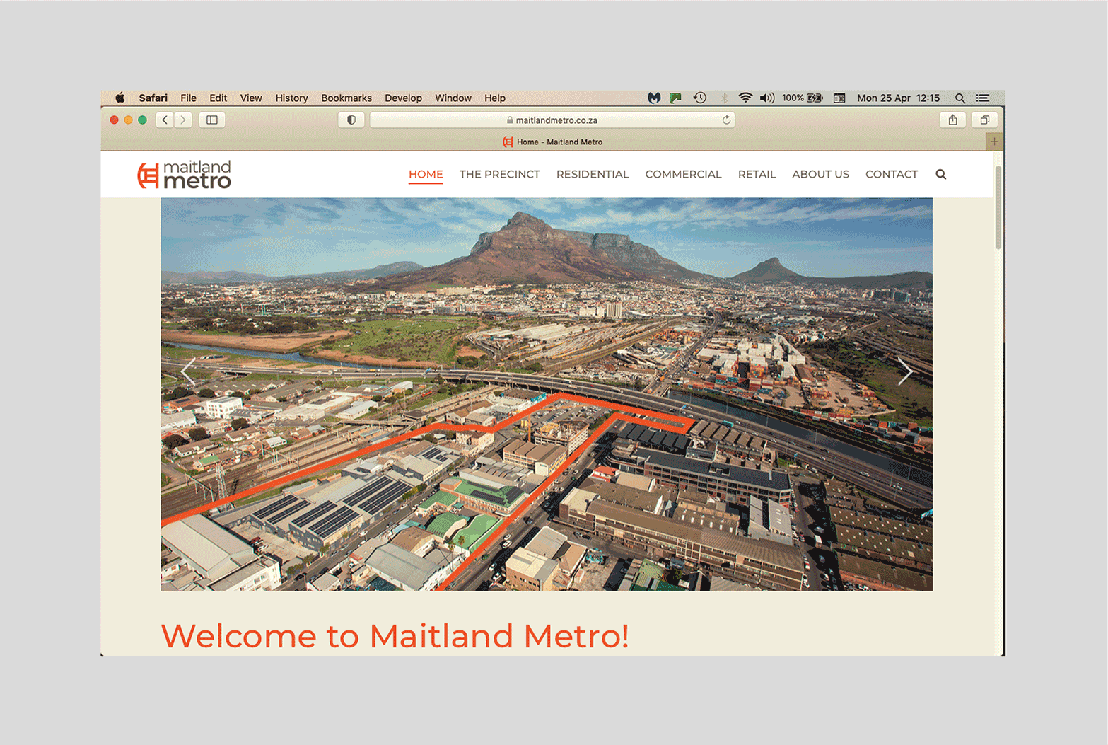
12 Brand expression – website home page.
13 The Prime logo.
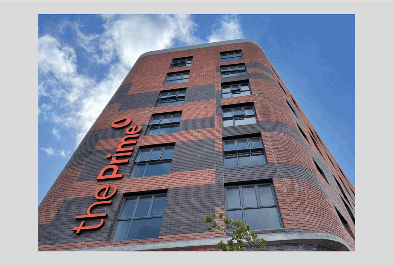
14 The Prime main exterior illuminated sign.
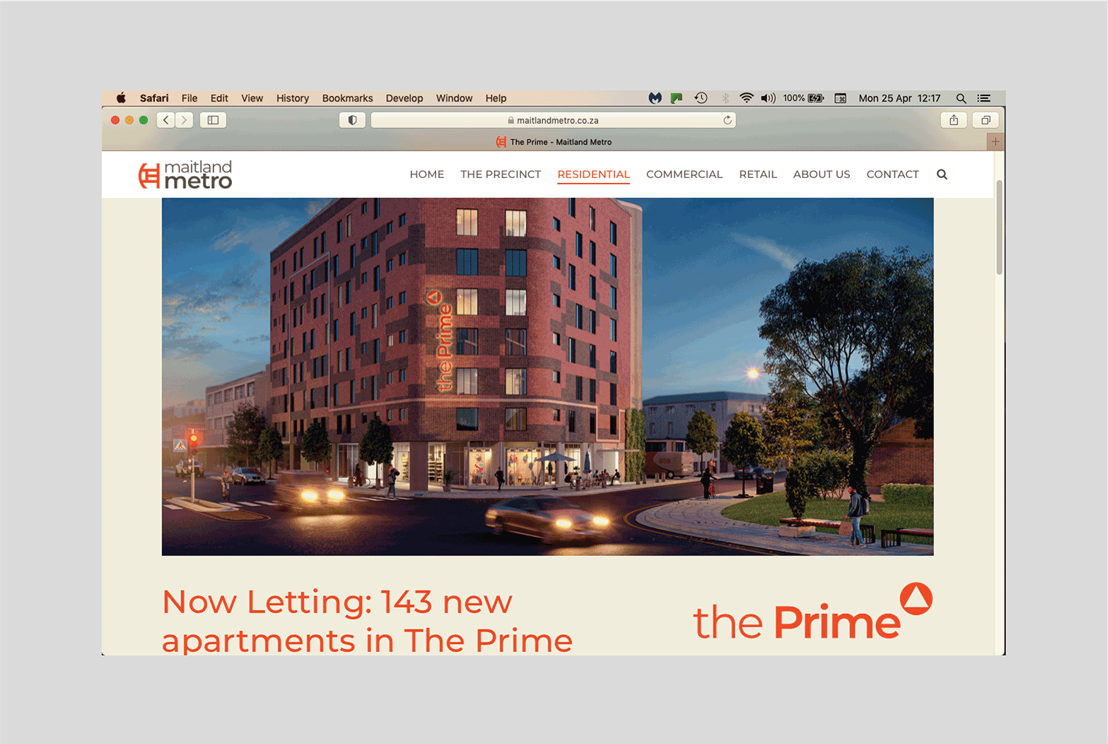
15 The Prime main page on the Maitland Metro website.
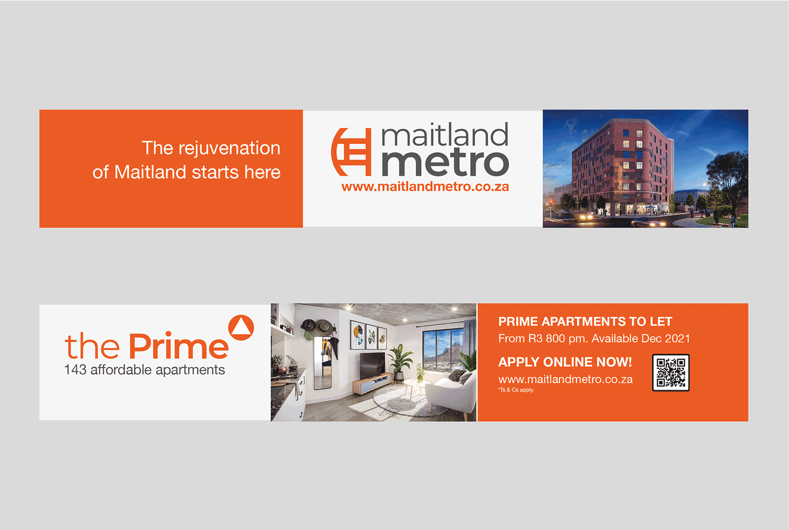
16 Onsite hoardings prior to the completion of the first building, The Prime.